About
the Paintings
To see my paintings in person, please visit the Cheltenham Center for the Arts Shop in Elkins Park, Pennsylvania. Any piece you see here on my website that is marked "Price upon request" can be viewed at the shop simply by letting me know when you'll be able to come in to see it. So let me know via email at bertgrrrl@yahoo.com and we'll set up an appointment.
In the course of the past six decades I have worked in a large number of media, but over time I have found that acrylic paint is the best fit for me. This is mostly due to its fast drying time, which allows me to build up layers of glazes and develop colors gradually. For the majority of my career, I painted outdoors, on site in classic plein air style. As time went on, however, the limitations of that style felt more and more restrictive. Frankly, I got tired of fighting with weather in order to paint, as well as missing out on what could have been wonderful paintings because I was unable to stay on location long enough to complete the piece.
Currently I use photography and on site color sketches to build research for a painting, then complete the piece in my studio. I still work very quickly—the lasting influence of plein air technique—and a typical piece takes only a few sessions to complete.
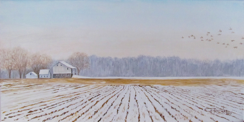
The 12” x 24” painting above, A Coating to an Inch, was completed with a very limited palette of only five colors: Titanium White, Raw Umber, Burnt Umber, Yellow Ochre and Ultramarine Blue.
A good contrast to its limited color palette is the work below, The Stream – Solstice Morning, a 14” x 11” painting of a nearby stream capturing the moment the sun crested above a ridgeline and added spectacular light to an otherwise monotone winter scene. It uses a much brighter and saturated color range, from the pure sunshine of Cadmium Yellow to the same mix of Raw Umber and Ultramarine Blue I use instead of black (I only use black paint to sign canvases, it's never part of my painting palette).

Unedited photo
|

Edited photo
|

Onsite watercolor sketch
|

Pallete used for
The Stream - Solstice Morning
|

Studio session 1
|

Studio session 2
|

Studio session 3
|

Studio session 4
|
On site, I took a rapid series of photographs from several slightly different angles knowing I would sort them out later, choosing the one I felt best captured the scene. I then did a very quick color sketch of the scene trying to lay down areas of color to use as guides to use when I did the photo editing and then the painting. This all happened very early one morning in December, with an ambient temperature that never rose above 38 degrees. The color sketch was done using thin washes of water color. I added notes in pencil to remind me of my impressions of both color and composition. Obviously, in those temperatures, one has to work quickly.
Once back home, I looked at the photos and began experimenting with color values and crops, both horizontal and verticle. Although onsite I had imagined the painting as horizontal, in the end I was happier with a vertical crop.
In the first studio session I defined the space with color, creating a rather abstract image. I used both the color sketch I had taken onsite and the edited version of the main photograph to draw the basic elements of the painting and then add areas of bright color in transparent washes.
After taking a break to let the paint dry and come back with a fresh look at color, and working from the distance forward, I added most of the details that place the viewer in a narrow ravine as the sun rises over the steep ridge to the left.
More details were added in my next session including the thinner branches and finer ripples in the stream. After this step I took a break lasting several days during which I did not look at the canvas.
In my final painting session I adjusted contrast and color saturation to give the piece a greater sense of distance and depth while also toning colors up or down as needed to achieve the result I was seeking. Looking at the canvas with a fresh eye is a critical part of my process as during the final stages adjustments are often the very fine tuning that gives the piece its strength. At this point I always go back to my original onsite color sketch when adjusting color values in the finished piece. In this case I brightened all the highlights and added tiny "sequins" of pure white to replicate the sparkle of the sunlight on the stream.

I’ve found that adding a frame can change a great deal about a piece of art, so the final step is to frame the piece, set it aside for a few days and then see if it needs any further fine tuning.
In this case I decided I like it just the way it is!
Thanks again for stopping by,

See more of my paintings
Or find news
about:
The
Artist-
The
Books
bertgrrrl@yahoo.com
All
images, book excerpts & web design © Roberta Lee 2007
- 2019
(Privacy
Policy: I DO NOT collect information on this website.)
|
